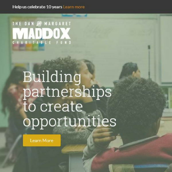
Evolution pulls us forward to be more than we otherwise imagined ourselves to be. This has certainly been true of the Maddox Charitable Fund. After emerging from a decade-long legal struggle, this once conservative foundation wanted only to fly below the radar and assume a low profile. The original website reflected this intent with stodgy gray tones, limited information about grantmaking priorities and stern, formal pictures of our founders, making them — and us — unapproachable. The website bespoke a transactional as opposed to a visionary approach to grantmaking. Ten years later, it no longer represented who or what Maddox had become.

Many things have contributed to this metamorphosis — a diverse board, a vibrant local philanthropy community and, most of all, the creative, dynamic voices of our nonprofit partners. In 2016, Maddox began hosting listening meetings with small groups of CEOs and direct-service staff. Our partners talked about the daily challenges they face but also about the larger environmental drivers that require their strategic responses. We left these early meetings energized and with a clear message: Maddox needed to use its voice as well as its dollars.
One early step in finding that voice was to develop an advocacy policy; before long, however, we realized that the most powerful public representation of Maddox was our website — and that it had to be transformed if it was to be inviting and relevant. Grantmakers for Effective Organizations (GEO) has been a strong partner throughout Maddox’s evolution, inspiring conversation about everything from operations and capacity grants to workshops on culture and collaboration. GEO’s influence lies at the heart of our redesigned website’s guiding principles of relationships, accessibility and transparency.
Relationships
The north star of our new site became making the foundation — its staff and its board — more approachable. Candid photos, personal bios, preferred pronouns and an informal visual design were used to create a more accessible, open-door vibe. Including a profile of the office dog on the site broke down traditional power dynamics while, in the process, giving rise to many shared dogs stories.
The Grant Directory, including logos, mission statement and links to websites, promotes the efforts of our nonprofit partners — where the transformative work is being done. Dusting off and optimizing our Facebook and Twitter accounts allowed us to lift our partners up through new grantee profiles and other spotlights. It has also enabled us to communicate with them more effectively, and not just during formal grant application and reporting seasons. Social media has likewise equipped us with a stronger, timelier platform for our advocacy on the public policy issues that impact the nonprofit sector.
Refreshed with irregular, non-institutional typeface, our site’s informal new logo is inspired by historic handset letterpress printing and nods affectionately toward Hatch Show Print, a Middle Tennessee institution.
Accessibility
A message that came through loud and clear from our nonprofit partners in those early listening meetings was: “Make the information we need more accessible!” To that end, a searchable grant directory with five years of grantmaking history was created, along with the option to download entries in Excel spreadsheets if that is the user’s preferred method of viewing data. Downloadable versions of the online application in Microsoft Word, clickable FAQs and pages dedicated to each of our three program areas give quick access to grant writing tools. All of these enhancements save valuable staff time, make our site visually more accessible and communicate to our community partners that Maddox is in sync with the challenges grant-seekers face.
Transparency
Maddox knows that it’s impossible to build authentic and abiding relationships without transparency. That’s the reason the theme of accountability runs throughout our new website. Our transparency policy can be found on our home page, while visitors to the About Us section of our site will find board member demographics as evidence of our commitment to intentional equity. Audits and 990s are also available at the click of a button, as is our whistleblower process, along with an anonymous hotline for reporting possible ethical violations.
Throughout the development process, we stayed focused on the user experience with focus on our nonprofit partners. All the while, laying the groundwork for our new interest in advocacy by engaging a larger community audience.
Our original website reflected who and what Maddox was; our new site captures who we are becoming. Already the Maddox board is engaged in intentional conservations with an eye toward adding greater definition to our values and voice. We know that if we want to make deep and lasting changes, we must start with ourselves, even as we continue to evolve. The philosophy of “glass pockets” giving will continue to guide the foundation into the future.
Our new website launched last week, but we continue to welcome feedback about ways to improve it. To that end, we invite you to visit the site and to share any ideas you have for promoting stronger relationships, accessibility and transparency. We remain a work in progress.
Kaki is the Executive Director of the Dan and Margaret Maddox Charitable Fund in Nashville Tennessee. Prior to joining The Maddox Charitable Fund, Kaki was the Director of GivingMatters.com at the Community Foundation of Middle Tennessee. Her volunteer work focuses on issues of immigration reform and affordable housing.

